Visualization gallery
The visualization methods implemented in PEtab Select are demonstrated here. These methods generally visualize the output of a model selection task, so the input is generally a list of already-calibrated models.
All dependencies for these plots can be installed with pip install petab_select[plot].
In this notebook, some calibrated models that were saved to disk with the to_yaml method of a Models object, are loaded and used as input here. This is the result of a forward selection with the problem provided in calibrated_models. Note that a Models object is expect here; if you have a list of models model_list, simply use models = Models(model_list).
[1]:
import matplotlib

import petab_select
import petab_select.plot

models = petab_select.Models.from_yaml(
    "calibrated_models/calibrated_models.yaml"
)
[2]:
models.df.drop(
    columns=[petab_select.Criterion.AIC, petab_select.Criterion.BIC]
).style.background_gradient(
    cmap=matplotlib.colormaps.get_cmap("summer"),
    subset=[petab_select.Criterion.AICC],
)
[2]:
| model_id | model_hash | Criterion.NLLH | Criterion.AICC | iteration | predecessor_model_hash | estimated_parameters | |
|---|---|---|---|---|---|---|---|
| 0 | M-000 | M-000 | 17.487615 | 37.975230 | 1 | virtual_initial_model- | {'sigma_x2': 4.462298422134608} |
| 1 | M-001 | M-001 | -4.087703 | -0.175406 | 2 | M-000 | {'k3': 0.0, 'sigma_x2': 0.12242920113658338} |
| 2 | M-010 | M-010 | -4.137257 | -0.274514 | 2 | M-000 | {'k2': 0.10147824307890803, 'sigma_x2': 0.12142219599557078} |
| 3 | M-100 | M-100 | -4.352664 | -0.705327 | 2 | M-000 | {'k1': 0.20160925279667963, 'sigma_x2': 0.11714017664827497} |
| 4 | M-101 | M-101 | -4.352664 | 9.294673 | 3 | M-100 | {'k1': 0.20160925279667963, 'k3': 0.0, 'sigma_x2': 0.11714017664827497} |
| 5 | M-110 | M-110 | -5.073915 | 7.852170 | 3 | M-100 | {'k1': 0.20924804320838675, 'k2': 0.0859052351446815, 'sigma_x2': 0.10386846319370771} |
| 6 | M-111 | M-111 | -6.028235 | 35.943530 | 4 | M-100 | {'k1': 0.6228488917665873, 'k2': 0.020189424009226256, 'k3': 0.0010850434974038557, 'sigma_x2': 0.08859278245811462} |
To use the plotting methods, we need to first setup an object that contains information common to multiple plotting methods. This can include the models, custom colors and labels, and the criterion.
[3]:
# Custom colors for some models
colors = {
    "M-000": "lightgreen",
    "M-001": "lightgreen",
}

plot_data = petab_select.plot.PlotData(
    models=models,
    criterion=petab_select.Criterion.AICC,
    colors=colors,
    relative_criterion=True,
)

# Change default color
petab_select.plot.DEFAULT_NODE_COLOR = "darkgray"
UpSet plot
This shows models ordered by criterion, with their parameters directly below the bars.
A black dot indicates that the parameter (e.g k2) is estimated in the model (e.g. the first bar is a model with k1 and sigma_x2 estimated).
[4]:
petab_select.plot.upset(plot_data=plot_data);

Best model from each iteration
This shows strict improvements in the criterion, and the corresponding model, across all iterations of model selection.
Since there were no improvements after M_100, no other iterations or models are shown.
[5]:
petab_select.plot.line_best_by_iteration(plot_data=plot_data);

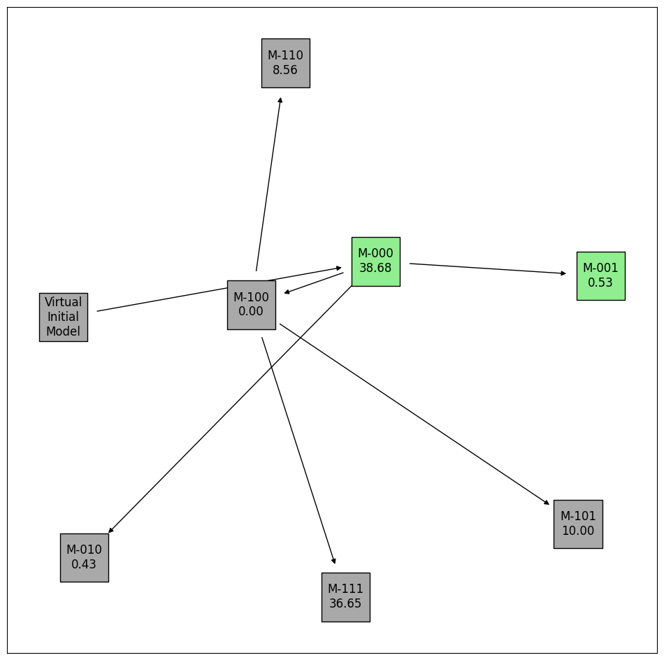
Selection history trajectory
This shows the relationship between models across iterations. For example, M_000 was the predecessor model to M_001, M_010, and M_100.
[6]:
# Add the relative criterion value to each label
plot_data.augment_labels(criterion=True)
petab_select.plot.graph_history(plot_data=plot_data)
# Reset the labels (remove the relative criterion)
plot_data.augment_labels()
Criterion values of each model
This shows the criterion value of every calibrated model.
[7]:
petab_select.plot.bar_criterion_vs_models(plot_data=plot_data);

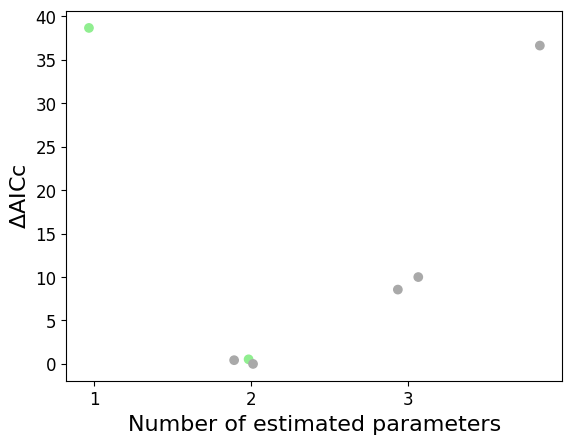
Criterion values vs. number of estimated parameters
This shows all calibrated models.
In this example, models with 2 estimated parameters tend to perform best. This is also seen in the UpSet plot above.
Jitter is added to distinguish models with the same number of parameters and similar criterion values, according to the optional max_jitter argument.
[8]:
petab_select.plot.scatter_criterion_vs_n_estimated(
    plot_data=plot_data,
    # Uncomment to turn off jitter.
    # max_jitter=0,
);
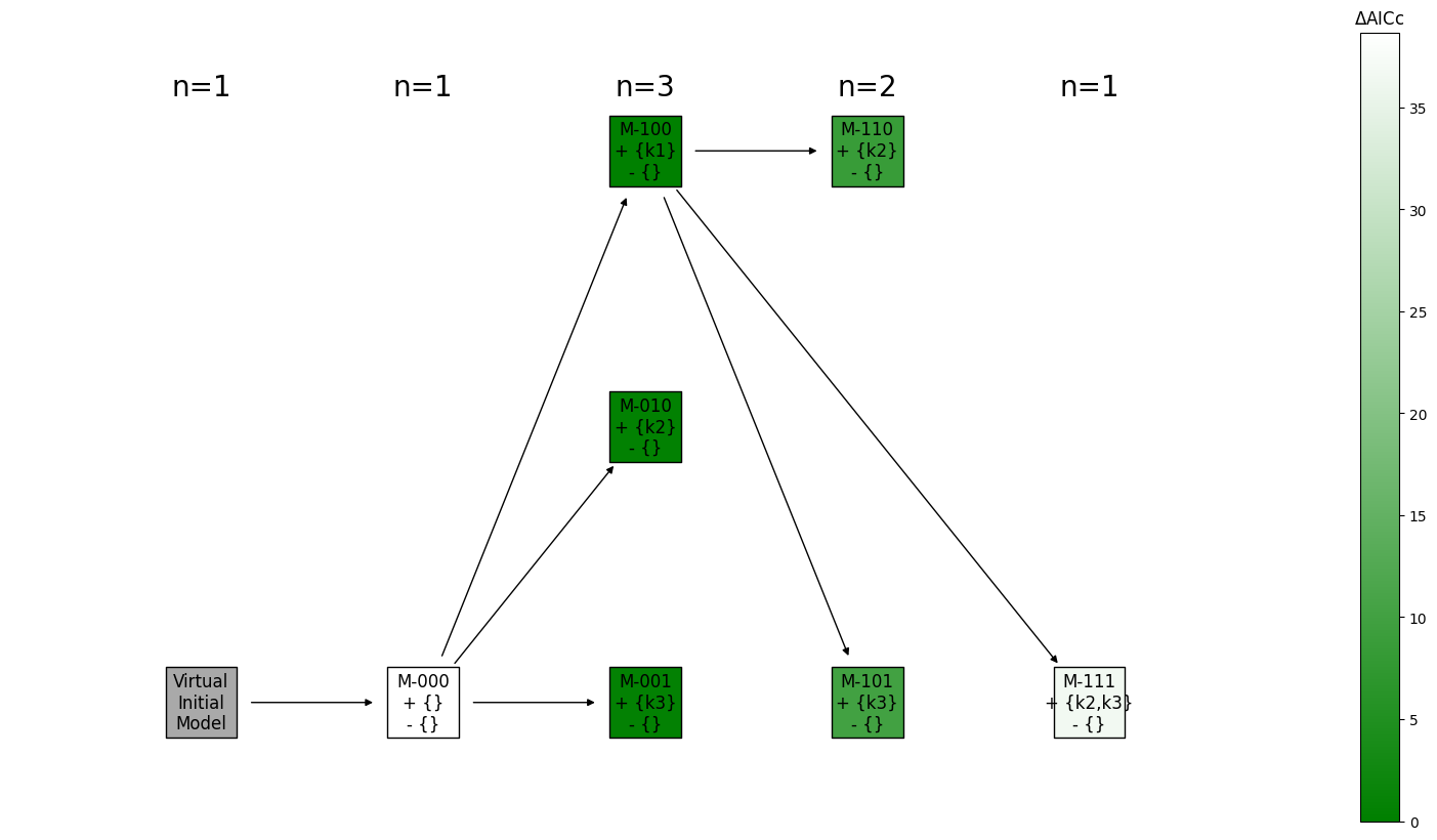
History as layers in a hierarchical graph
This shows the relative change in parameters of each model, compared to its predecessor model.
Each column is an iteration.
[9]:
# # Customize the colors
# criterion_values = [model.get_criterion(petab_select.Criterion.AICC) for model in models]
# norm = matplotlib.colors.Normalize(
#     vmin=min(criterion_values),
#     vmax=max(criterion_values),
# )
# cmap = matplotlib.colors.LinearSegmentedColormap.from_list("", ["green","lightgreen"])
# colorbar_mappable = matplotlib.cm.ScalarMappable(norm=norm, cmap=cmap)

# Augment labels with the changes in parameters of each model, compared to their predecessor model
plot_data.augment_labels(added_parameters=True, removed_parameters=True)

petab_select.plot.graph_iteration_layers(
    plot_data=plot_data,
    draw_networkx_kwargs={
        "arrowstyle": "-|>",
        "node_shape": "s",
        "node_size": 2500,
        "edgecolors": "k",
    },
    # colorbar_mappable=colorbar_mappable,
);